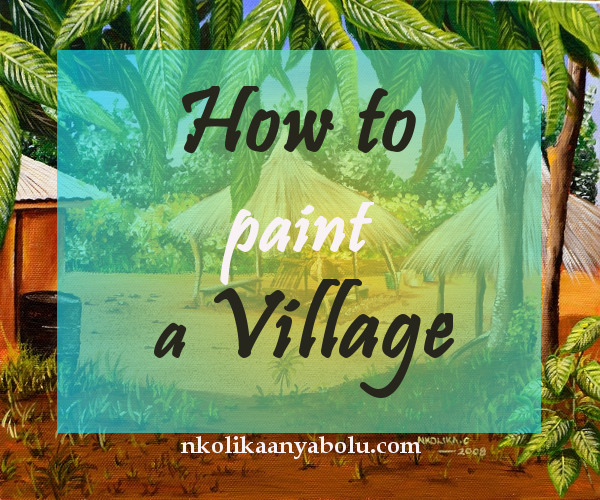
Painting With Acrylics: How to Paint A Village
This is a Step by Step Demonstration of a painting of a village I did a few years ago. I have tried to make it simple and have broken it down into 10 steps in order not to bore you. I particularly loved making this painting and I hope you would give it a try.
There is a video at the end which you can watch at your leisure.
Painting Materials:
Canvas board (10” x 12” or 254 x 305mm)
Charcoal pencil
Fixative
Water atomizer
Cup of water (for putting my brushes whilst I am working)
Putty eraser
Palette
Painting Brushes:
- 3 round Galeria brushes (0,1,5)
- 1 flat Galeria brush
- 1 size 0 Cotman brush
- 1 old brush
Acrylic Paints and Medium:
- Yellow ochre
- Burnt sienna
- Cadmium yellow deep hue
- Ultramarine blue
- Cadmium red
- Burnt umber
- Sap green
- Titanium white
- Painting medium
- Acrylic Gloss medium
STEP 1:
I made a sketch with a charcoal pencil. The sketch was not elaborate by any means. Just something to give me an idea of where the basic features of the painting were e.g. the thatch houses, the edge of the building and the drum. I then fixed it with a fixative which I sprayed on the work.
I was already getting really excited because I could see the finished work in my head but I was conscious not to be in any form of a hurry.

STEP 2:
This was the most anticipated step for me. I was going to try painting on a coloured canvas for the very first time. I had once heard some artists loved painting on coloured canvasses but I never seemed to warm up to the idea because I simply loved the whiteness of my canvasses. Thus today I decided to paint on a coloured canvas.

I coated the entire canvas with 3 layers of very thin wash of burnt sienna. The wash was made up of 1 part of burnt sienna paint and 3 parts of water.
This is the only place where I used water to dilute the paint. I then used Acrylic gloss medium throughout the entire work. I felt cold shivers run up my spine when I was covering the whole canvas. I started missing my “usual” white canvas even before I commenced with the actual painting.
Yet again, covering the entire canvas made me all the more interested in seeing how this would really come out. This technique is called Imprimatura.
STEP 3:
When my coating was dry I went on to paint the sky. Here I used Ultramarine Blue and Titanium White for the sky. From the minute I applied the first brush load of paint onto the sky I noticed something remarkable.

The paint seemed to jump straight out. Quite unlike when I painted on a white canvas; this seemed to have something about it that was so different. Unlike painting on a white canvas where it takes several layers of paint to build up the tone of the work; here with the first layer of paint, the work had already taken shape.
I applied 2 layers to the sky. See more on How To Paint the Sky.
STEP 4:
With the difference I was already seeing and experiencing in this new painting technique I was exploring, I became very excited and as the work glowed I also started glowing from inside. I went ahead to put in the vegetation in the background.
In this step, I concentrated on the vegetation furthest away. I used a mixture of Cadmium Yellow Deep Hue + Ultramarine Blue for the middle tones. Added Burnt Umber to the mixture for the darkest parts and Titanium White to the initial mixture to give the light tones.

STEP 5:
I got carried away with the work forgetting to take some shots of the different stages. But thankfully I had not gone very far before I took this shot.
Here I have painted the vegetation or scrubs closest to the foreground. I used a mixture of Sap green + Ultramarine Blue + Cadmium Yellow and Titanium White.
For the darkest parts, I added Burnt Umber. I paint shrubs and trees by painting wet in wet by making small gentle dabs in different directions depending on the direction of the leaves.

For the foreground, I used Yellow Ochre + Burnt Sienna + Titanium White. And for the elevated ground closest to me, I used the same mixture as above but added Burnt Umber and Ultramarine Blue to darken it.
For the corner of the house, I used a lighter shade of my dark foreground.
At this stage, I am quite happy with the work. Notice how depth and distance are created with the play of colours.
As a rule in painting; THE CLOSER AN OBJECT IS TO YOU THE DARKER IT GETS AND THE FURTHER IT IS THE LIGHTER.
Sometimes, I myself do not stick to the rules so stringently. I only use it as a guide when I paint. The goal of every artist should be to have his/her own style. Be free to break away from the norm.
STEP 6:
At this stage, I have started putting in little details into the painting. This is where the beauty and advantage of Acrylic Gloss Medium can be seen. It enables you to put in very fine details while retaining the texture and quality of your acrylic paint. Water simply thins out the paint and at some point, you lose the quality of the paint.

In this step, I have put in some clay pots, buckets and seats under the thatched house. I used the Cotman brush at this stage because of its fine nature.
I continued to build up the house by using the same mixture as the first layer (Burnt Sienna + Yellow Ochre). Added Cadmium Yellow and Titanium White to the part where light is falling on.
For the deep crevice in the middle of the house and the shade under the wooden bar of the roof, I added Burnt Umber and Ultramarine Blue.
Also added a thin coat of white dirtied with umber to the roof of the house. At this stage, I step back to look at the work. So far so good.
I love the feel of the painting. All through I have been using the atomizer to keep my paints wet because acrylic paint's drying time is notoriously short. See more Tips on How To Use Acrylic Paint.
Step 7:
At this stage, a lot of things seemed to have happened between shots. I have added in the thatch on the roofs and the drum beside the house. The painting seems to speak out at this stage.
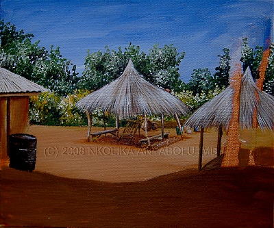
For the thatch roofs I used: Cadmium Red + Sap Green + Titanium White + tinge of Burnt Sienna. I love painting thatch (or straw) roofs. I used the size ‘1’ round galleria brush here. To paint it I simply drew thin lines over and over again. I built up in 4 layers.
For the drum, I used a mixture of Burnt Umber + Ultramarine Blue + Sap Green for the darkest parts. I added a tinge of Yellow Ochre and Titanium White for the lighter side. I do not like using black in my paintings except when I am painting abstracts or clothing.
I always mix up my “black” by mixing 2 very dark colours usually Alizarin Crimson and Burnt Umber or in this case Burnt Umber and Ultramarine Blue. You could also try Burnt Umber and Prussian Blue. Black in landscape painting has a dulling effect because after all there is no black in nature.
For the shade, under the thatched house, I used an initial glaze of Burnt Sienna. After it had dried I applied another glaze of Burnt Umber + Ultramarine Blue. It is always amazing how a painting takes shape when shades and shadows are added.
WHAT DO YOU THINK?
STEP 8:
The grasses in the foreground are added. I have tried to use dull colours in order to enhance the darkness of the shade. I used mainly Cadmium Yellow + Ultramarine Blue with a tinge of Yellow Ochre.
For the darkest leaves, I used the same mixture for the drum.

There are times I simply use whatever colour I find on my palette. I worked in layers here. The first was adding a thin glaze of Burnt Umber and Ultramarine Blue to darken the shadow. Then added the leaves.
At this stage, I started putting in a plant at the edge of the painting. This is a foretaste of what is about to happen to the entire work. Are you ready?
STEP 9:
This is the stage my Landscape paintings get to and everything seems to go upside down. Some observers who watch me paint (on a few occasions!) are almost always infuriated, confused and intrigued by the fact that I tend to “spoil” my paintings. But do I really “spoil” them?

Here I have started the first step in the process of “spoiling” this painting. I have added the first set of leaves of a tree that cover part of the painting.
Also at the bottom-right edge of the painting, a plant is added. The idea is to leave as little of the painting as possible for an observer to see. This at the end of the day pulls the observer into the painting.
Naturally, the human brain inquires more into what it does not know and cannot see. The more something is made less open the more the brain develops an interest in it. I almost always cover the best parts of my paintings in this way. And I often use trees or plants.
STEP 10:
Here I have added another glaze of Burnt Umber and Ultramarine Blue on the foreground directly under the tree to deepen the shade. And have also built upon the leaves hanging down.
I have also added some stones and pebbles to the foreground. This is where the old brush comes into play.
DO YOU THINK THE PAINTING WAS “SPOILT”?

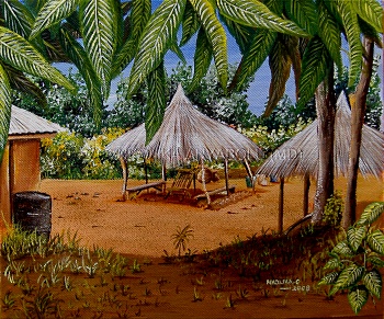
Acrylic on Canvas Painting of a Village © Nkolika Anyabolu
Watch the video
Please subscribe to my Youtube Channel to stay up to date with my creative process.